My Website

Website Evaluation
I used WIX.com to make my site. My website meets all customer needs and target audiences. My home page seen here above is sleek and engaging, It has all the information someone visiting our website would need. Team members, which i put down as "family" to appeal to the customer that we consider everyone as a family in the store. I also used a very captivating image on the front page of diamonds sparkling on a glass table. My logo is positioned and pinned at the bottom left of the screen so when you navigate the website you can always see the logo, I made sure it did not cover anything on the website. My website is fully functioning with links pinned to any buttons such as the menu bar at the top of the site. All buttons lead to facts about the business and the people working there. I also put in a contact us page with a Phone number, email, address and social media. At the beginning i had some difficulty organising the site but I made the pages easier to read and handle by simplifying the layout.
Similar Website

This website is very plain and simple with nothing special or eye-catching. There is a lot of empty space which could be filled with something that makes the buyer interested and want to explore the page further. While simplicity gives it elegance which is wanted for a jewellery website, it could be improved with certain touches, such as a different font on the heading or a home page, and not straight into the products. Shopping online does not need to be swift, customers want to be intrigued by the layout.
Copyright
Copyright refers to a piece of intellectual property owned by the person to whom it was created. For example a certain song, sound, or catchy jingle such as the McDonald's "I'm Lovin' It". However, this was registered as a trademark by the company in 2003.
Copyright is an international right that gives the creators of music, artwork, or any type of material the right to choose and control the way in which it is used.
Image File Type
Resolution means the amount of detail in an image or video recording. It more specifically relates to the amount of pixels in an image. The better resolution an image has the more pixels it contains.
The JPG is the standard file format used for digital cameras and the most used image format.
Differences
PNGs support image transparency, but JPEGs do not.
PNGs are a lossless format.
JPEGS uses a lossy compression algorithm, which means some of the image data is lost but the image size is reduced.
GIFs are best for storing animated images but it only contains 256 colours and has patent restrictions.
JPEGS are best for storing full-colour images with complex shading and colour variation but it uses lossy compression that reduces the image quality.
Package Sketch

Logo Sketch

Brand, Logos and Slogans
A Brand is a type of product created by a certain company or created under a certain name.
A Logo is a certain symbol or combination of text that represents a brand, service or product. It is the face of your company or business which helps customers recognize or remember you.
A Slogan is a short phrase or memorable sentence that is used in adverts to express value or benefits.
Bing Logo

The MasterCard logo is an unimpressive logo that only consists of two circles with MasterCard underneath in a thoughtless, dull font with
Weblink to my Website
https://cp563853.wixsite.com/hdjs
Animated Logo
Animated Logo Evaluation
This is my animated logo. I made it using Adobe animate. I looped it so it would go forever. I included classic tween in the animation at the beginning, middle, and end. It also has key frames including the beginning and end. What I would improve is probably speed up the animation so it pops up faster. I had problems with creating the shape of the diamond and I didn't know whether to make it wider or longer but I decided to make it longer as it looked more stylish. My older design looked more bulky and ugly, whereas a pointy shape looked neater.
Planning the Product
Pros and Cons:
Pros:
- It makes you look more appealing
- Increases confidence
- Real gold and silver
- Real diamonds, emeralds, rubies, sapphires, amethyst
Cons:
- Expensive
- Heavy
- Only comes in gold and silver, rose gold is not available
Name of the Website: Heavy Duty Jewellers
Logo
Old Design
 |
| I created this design as a base for my finished design below. This also included the company's HD in the middle of the logo but i added it later. |
Finished Design

Logo Evaluation
Package

This is the package for my product which I made using Adobe Photoshop. It is a black velvet box with cushioning inside to preserve the jewellery. I added my logo to the box but I changed the lining of the logo to white to add to the box as it is visible and looks better. I applied the logo onto the box with the distort tool on Adobe Photoshop. This package is suitable for my product and target audience as it is specifically for jewellery and it is made of a soft material like satin to improve the longevity of the jewels and metals. I could have improved the package by adding more interesting personal touches to the box such as the name of the business on the side of the box in white. I had problems adding my logo onto the package because it was supposed to be outlined in black but then it wouldn't be visible.
Product Name and Example
Silver Cuban Link 18MM, 14K

Personalised Example

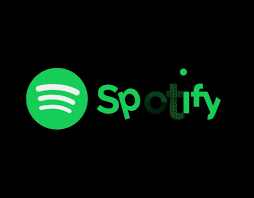
Spotify

The Logo consists of a green circle with three lines which vary in size. It is clearly for music streaming and downloading. It has been made with green color on a black background. It is an interesting-looking logo as it does look like sound waves which brings to mind that it is a music app. The animation lasts approximately 4 seconds. The animation begins with the 4 white dots using morph animation in the logo which is simple and elegant. The lines also change from white to black which slyly makes us think about the wifi symbol.
Google
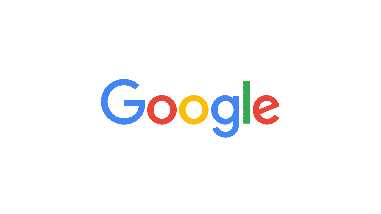
The Google logo consists of 4 dots different colored dots which make up the Google sign, name, and microphone. This logo is similar to the Spotify logo as they both use morph animation to form their name and sign. The animation is roughly 10 seconds long


No comments:
Post a Comment